Instructions
On this page
Basic: Using CEL icons in LEARN
Icons can be added to an HTML page in LEARN using LEARN’s WYSIWYG editor.
[Note to CEL developers: follow these instructions to ensure your course follows CDS 5.3]
- Browse the CEL Icons and locate the icon you wish to use.
- Copy the Direct Link (url) for the icon to the clipboard. E.g.,
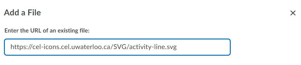
https://cel-icons.cel.uwaterloo.ca/SVG/activity-line.svg
We recommend using the .svg icons, as they scale to any size.
- In LEARN open the HTML page you wish to add the icon to.
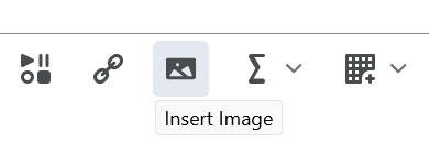
- Put your cursor where you want the icon to appear. If you want to add the icon in front of a heading, make sure the heading is already on the page, and put your cursor before the first letter. Click the Insert Image button in the toolbar
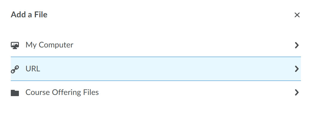
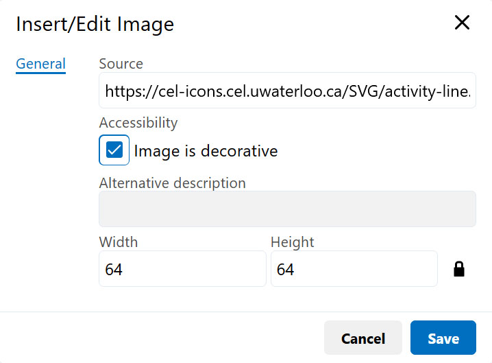
- Choose the URL option
- Paste in the URL to your chosen icon
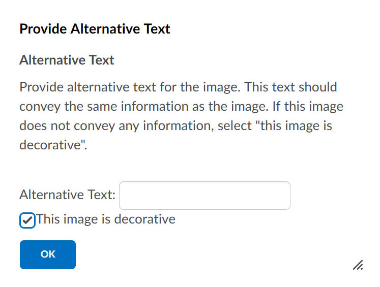
- You will be prompted to add an alt tag to the image. In most cases, icons would classify as 'decorative', so you can tick that box.
- If you are using an .svg, you will need to resize the inserted image to suit. Right click on the image and click on the 'Image' button to bring up it's properties.
- You can now change the width and height of the icon. We recommend staying in multiples of 32 (32x32, 64x64, etc.)
- Final Result

Video instructions
Basic: Using CEL icons in Möbius
Icons can be added to content in Möbius using the Image button in the edit toolbar. This functions the same as adding an image to content
- Browse the CEL Icons and locate the icon, and possible alternate versions, you wish to use.
- Copy the Direct Link (URL) for the icon, e.g.,
https://cel-icons.cel.uwaterloo.ca/SVG/activity-line.svg
We recommend using the .svg icons, as they scale to any size.
- In Möbius, open the content page/item you wish to add the icon to.
- Put your cursor where you want the icon to appear. If you want to add the icon in front of a heading, make sure the heading is already on the page, and put your cursor before the first letter. Click the Image button in the toolbar
- In the URL field, paste the link to your chosen icon
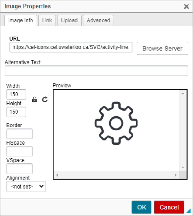
- In most cases, icons would classify as 'decorative', so leave the Alternative Text field blank.
- You can change the width and height of the icon. If you are using an .svg, you will need to resize the inserted image from the default of 150px. We recommend staying in multiples of 32 (32x32, 64x64, etc.).
- Alternatively, you can click OK to see the default size on the content page. Simply double click the icon to bring up the Image Properties window again to resize the icon.
- Select OK to view the final result.
Advanced: Using CEL Icons via CSS and unicode
CSS setup
This step is only required if you are developing content pages in:
- the CEL CMS that are not based on the CEL template
- Möbius
- any other external system
Add the following style.css stylesheet to your pages.
<link href="https://cel-icons.cel.uwaterloo.ca/style.css" rel="stylesheet">
Or, if you don't have access to add CSS to the
of your HTML pages, but have access to a CSS file, you can add this to the top of that CSS:
@import url("https://cel-icons.cel.uwaterloo.ca/style.css");
If you are using the icons as a webfont and you intend to work offline you can install the font (celicons.ttf) locally on your computer. However, you will need to redownload and reinstall the font every time it is updated.
Adding CEL icons using CSS
Adding a class to an HTML element is the easiest way to use these icons. When using this method, the icon is applied in a :before pseudo element, and the icon can be affected by normal CSS rules (color, margin, width, height, etc.). Some environments might not allow span elements, but you can use div or any other element instead.
This is the naming convention of the icon classes:

| Code |
Result |
<span class="celicon-activity-line"></span>
|
|
<span class="celicon-activity-fill"></span>
|
|
<span class="celicon-activity-line-contained"></span>
|
|
<span class="celicon-activity-fill-contained"></span>
|
|
Because this method attaches the icon through a font, you can manipulate the icon with the same CSS rules you use on fonts. This includes things like margin, padding, colour, font-size, font-color, etc.
Changing global styles
You can add this to your css file to change the styles of all icons throughout your pages. This CSS code will look through all classes on your pages that start with celicon- and apply the rules to them.
| Code |
Result |
[class^="celicon-"], [class*=" celicon-"] {
    color: #0093ff;
    font-size:60px;
}
|
|
Changing the colour
To change the color of individual icons, you can use the color property.
| Code |
Result |
<span class="celicon-activity-line" style="color:red;"></span>
|
|
If you want your icon to have a background colour, you want to use the background property.
| Code |
Result |
<span class="celicon-activity-line" style="color:#fdd54f;background:#000;"></span>
|
|
Changing the size
To change the size of individual icons, you can use the font-size property.
| Code |
Result |
<span class="celicon-activity-line" style="font-size:60px;"></span>
|
|
There are also some CSS sizing utility classes: celicon-xs, celicon-s, celicon-m, celicon-l, celicon-xl. Note that these are classes, and not inline styles.
| Code |
Result |
<span class="celicon-activity-line celicon-xs"></span>
|
|
<span class="celicon-activity-line celicon-s"></span>
|
|
<span class="celicon-activity-line celicon-m"></span>
|
|
<span class="celicon-activity-line celicon-l"></span>
|
|
<span class="celicon-activity-line celicon-xl"></span>
|
|
Using unicode in CSS
Each icon has a unique unicode that you can use in custom CSS pseudo selectors. You can find the unicode on your selected icon's detail page, and use it as follows:
| Code |
Result |
h2.unicodeExample:before {
    content:'\e902';
    font-family: 'celicons' !important;
}
<h2 class="unicodeExample"></h2>
|
Heading |